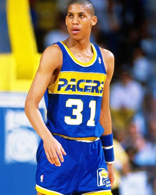
The Indiana Pacers have officially confirmed that their 2025-2026 City Edition uniforms will be a modernized take on the team’s iconic 1980s-era jerseys. This announcement has already sparked considerable discussion among fans, designers, and NBA uniform enthusiasts alike. Unlike recent editions that leaned heavily into contemporary street art motifs or bold, abstract interpretations, this year’s design is clearly rooted in nostalgia—though not without a few updates for the modern era.
Visually, the uniform builds from a base of simplicity and tradition. The primary color is a crisp, clean white, serving as a canvas that allows the bolder accent colors to pop. Across the chest is a broad, deep-blue panel, containing the word “PACERS” written in bold, capitalized yellow lettering. The letters are outlined in white, giving them definition against the blue backdrop. Directly beneath the team name, the player’s number is displayed in matching yellow and white, creating a balanced, symmetrical appearance that’s easy to read and highly visible on the court. A strong diagonal yellow stripe slices across the front of the jersey, creating motion and a visual division between the blue upper portion and the white lower portion. This diagonal element is a direct nod to the graphic styles that defined 1980s basketball aesthetics, but its placement and execution feel clean and sharp—well-adapted to today’s uniform trends.
The shorts continue this theme of retro-modern harmony. They remain mostly white but feature complementary detailing in blue and yellow. One of the standout design elements is located on the waistband: a special logo that blends the Pacers’ modern “P” basketball emblem with a classic blue-and-yellow color scheme from the team’s 1976 to 1990 logo. This symbol is placed inside the silhouette of the state of Indiana, creating a badge-like appearance that ties together state pride and franchise identity. It’s a small detail, but one that carries visual weight and sentimental value for long-time fans. The placement on the waistband ensures it remains a central, visible piece of the uniform without dominating the rest of the design.
This shift toward a retro-inspired jersey is especially noticeable when compared to the Pacers’ City Edition uniforms from the previous two seasons. The 2023-2024 version had a black base and was filled with graffiti-style paint splatter, a hand-drawn “INDY” wordmark, and bright neon accents that celebrated Indiana’s underground street art scene. It was bold, expressive, and entirely unconventional—one of the most visually aggressive uniforms the team had ever worn. In contrast, the 2024-2025 edition retained the paint-splatter motif but opted for a white base, softening the look while keeping the rebellious spirit intact. The “INDY” wordmark remained, still written in stylized, almost childlike handwriting, celebrating the city’s creative culture in a very literal way.
By contrast, the 2025-2026 City Edition represents a deliberate departure from that expressive street-art identity. Instead, it reconnects the team to its visual past, drawing clear parallels to the Pacers teams of the 1980s. This was a time before the iconic pinstripe era of the Reggie Miller days in the late ’90s, but it was a foundational period for the franchise’s visual development. The use of strong geometric shapes, bold primary colors, and straightforward lettering was emblematic of basketball uniforms during that decade. The new City Edition pays tribute to those roots but through the lens of 21st-century design sensibility: cleaner lines, higher-quality materials, and more strategic use of color blocking.
Initial fan reaction has been mixed, but highly engaged. On social media, a number of fans expressed excitement over the return to a cleaner, more traditional look. They appreciated the simplicity and the connection to the team’s history. For these fans, the uniform offers a breath of fresh air after two years of experimental design. Others, however, felt that the uniform lacked personality. Some described it as too safe, even bland, and said they preferred the artistic boldness of the earlier City Editions. These reactions highlight an ongoing tension within the NBA’s City Edition program: how to balance creativity and regional storytelling with the visual legacy and core identity of the team.
This year’s design certainly lands more on the side of tradition. But that doesn’t mean it’s without creativity. The diagonal stripe, for example, is more than just a visual flourish—it represents movement, direction, and progress, perhaps a subtle metaphor for the current direction of the franchise. The fusion of old and new logos on the shorts suggests a team that’s looking to honor its past while continuing to evolve. Even the decision to feature “PACERS” rather than “INDY” on the chest signals a return to emphasizing the team as a broader statewide brand rather than hyper-localized identity. For an organization that has sometimes struggled with national recognition, this might be a conscious move to reinforce its full brand name and appeal to fans beyond Indianapolis.
From a technical standpoint, the uniform seems built with performance and modernity in mind. While the aesthetic is retro, the materials used are undoubtedly cutting-edge. Lightweight, sweat-wicking fabric and improved tailoring ensure that these jerseys won’t just look good on fans—they’ll perform on the court. The design also scales well across various media platforms, whether it’s being viewed courtside, on television, or through digital platforms. In today’s NBA landscape, where social media exposure and global branding are almost as important as gameplay, a jersey must work across multiple contexts—and this one appears designed with that in mind.
The NBA’s City Edition program itself has always been about more than just the jerseys. It’s about storytelling. Each team is encouraged to use their City Edition uniforms to express something unique about their city, their fans, or their identity. In this case, the Pacers seem to be telling a story not just about their geographic roots, but about the era from which they emerged as a competitive NBA franchise. The 1980s were not the most successful on-court years for Indiana, but they laid the groundwork for the successes that would come later. Choosing to revisit this era suggests a desire to reconnect with that foundational energy—clean, sharp, and quietly determined.
In sum, the Indiana Pacers’ 2025-2026 City Edition jersey is a thoughtful blend of nostalgia and modernity. It swaps out flashy street aesthetics for a more classic sports design, rich in historical references and built for today’s fast-paced, highly visible NBA environment. It’s not a jersey that screams for attention, but rather one that stands confidently in its simplicity. It honors the 1980s without replicating it outright, using color and structure to create something that feels both familiar and fresh. For some fans, it may not be loud enough. For others, it might be the perfect return to form. Either way, it’s a uniform that tells a clear story—a story of where the Pacers have been, where they are now, and where they’re heading.


